

查看组件完整功能
由于依赖 UI 框架,文档中的组件配置项可能无法实时同步更新。以下以 element-plus 为例,介绍如何查看内置组件的实际可用配置项。
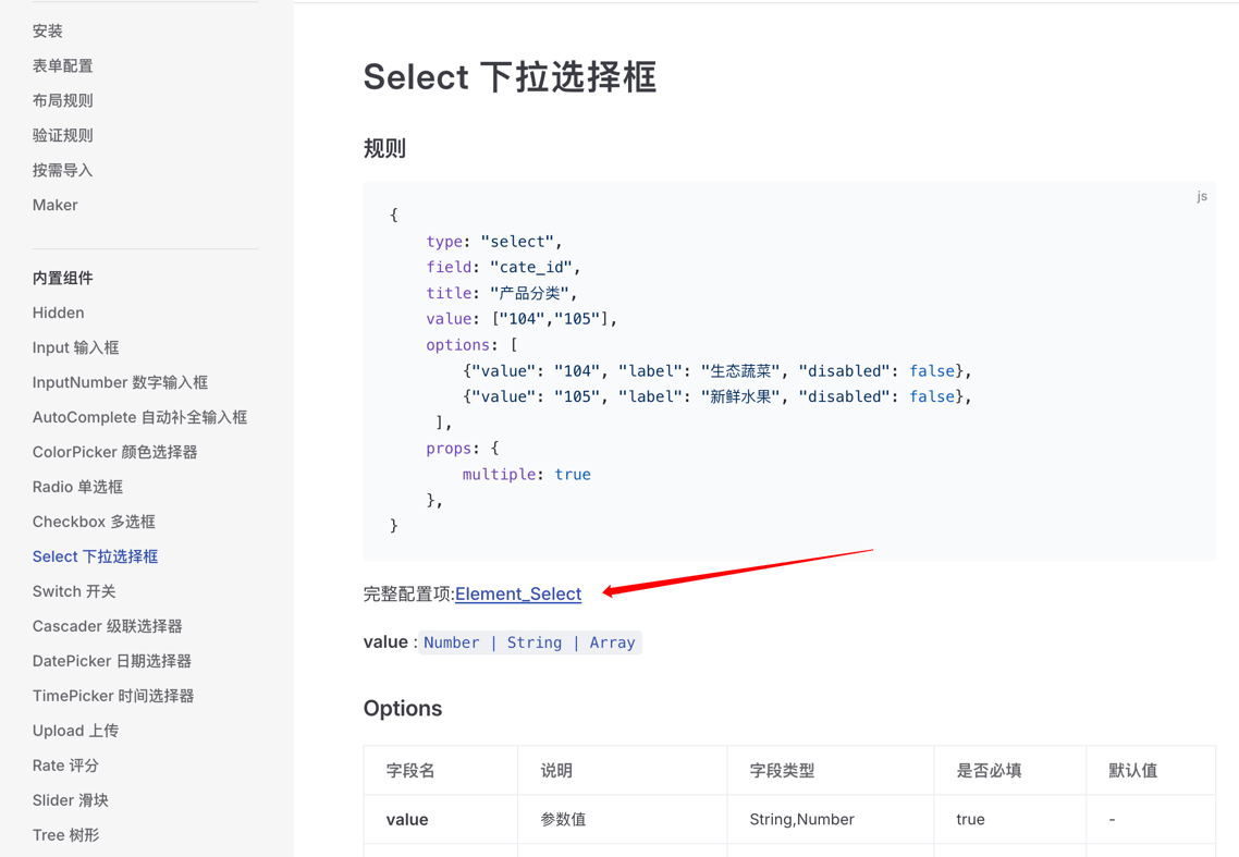
例如: 查看 Select 组件的完整功能列表及使用示例
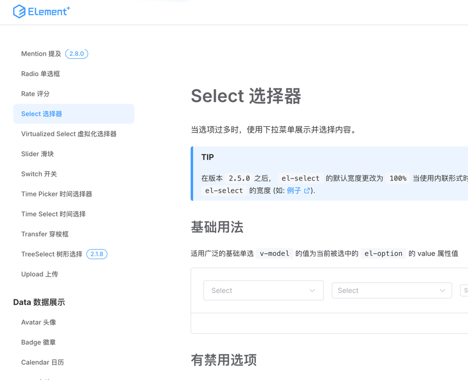
1. 找到组件对应的UI官方文档
通过文档中的链接
或者在 UI官网直接找到对应的组件
2. 查看组件的配置(props)
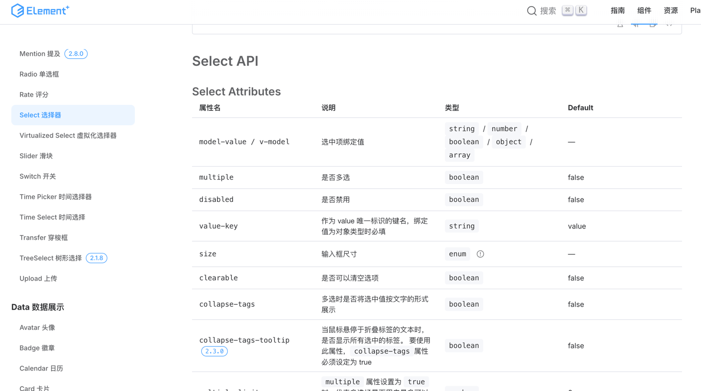
在规则中配置 props
3. 查看组件的事件(events)
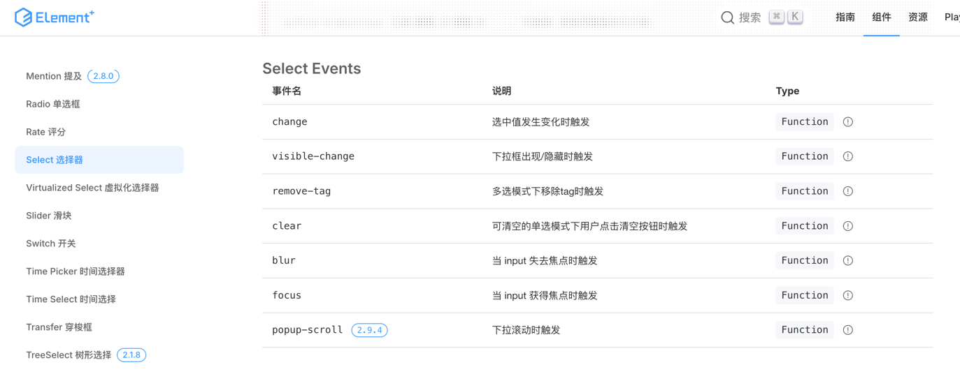
在规则中配置事件
4. 查看组件的插槽(slots)
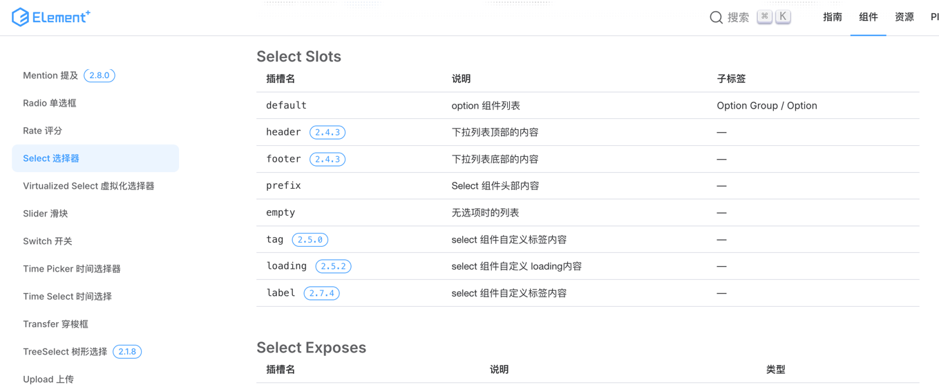
在规则中配置插槽
5. 查看组件的方法
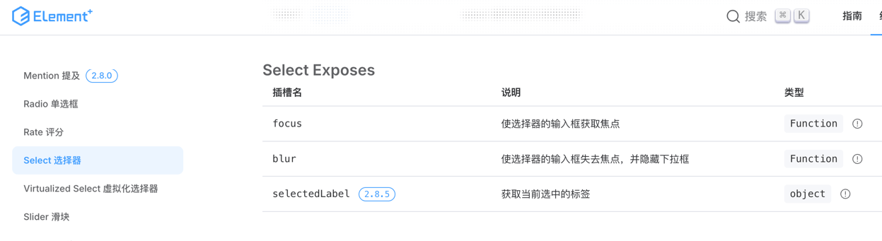
通过 api 调用组件的方法
js
const rule = {
    type: 'select',
    field: 'user_type',
    name: 'user_type_select',
}
//当组件渲染后可以通过 api 获取组件的示例
api.el('user_type').foces();
//通过 name 也可以同样调用
api.el('user_type_select').foces();