# Select 下拉选择框
# 规则
{
type: 'select',
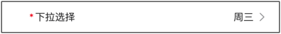
title: '下拉选择',
field: 'select',
value: 'Wednesday',
props: {
title: '预约',
options: [
{ text: '周一', value: 'Monday' },
{ text: '周二', value: 'Tuesday' },
{ text: '周三', value: 'Wednesday' },
{ text: '周四', value: 'Thursday' },
{ text: '周五', value: 'Friday' },
],
placeholder: '请选择',
}
}
参考:Vant_Picker (opens new window)
value :Number | String
# Options
| 字段名 | 说明 | 字段类型 | 是否必填 | 默认值 |
|---|---|---|---|---|
| value | 参数值 | String,Number | true | - |
| text | 字段别名 | String | true | - |
| disabled | 设置为禁用状态 | Boolean | false | false |
# Props
| 参数 | 说明 | 类型 | 默认值 |
|---|---|---|---|
| disabled | 是否禁用输入 | boolean | false |
| options | 对象数组,配置每一列显示的数据 | PickerOption[] | PickerOption[][] | [] |
| columns-field-names | 自定义 options 结构中的字段 | object | { text: 'text', value: 'value', children: 'children' } |
| title | 顶部栏标题 | string | - |
| confirm-button-text | 确认按钮文字,设置为空字符串可以隐藏按钮 | string | 确认 |
| cancel-button-text | 取消按钮文字,设置为空字符串可以隐藏按钮 | string | 取消 |
| toolbar-position | 顶部栏位置,可选值为 bottom | string | top |
| loading | 是否显示加载状态 | boolean | false |
| readonly | 是否为只读状态,只读状态下无法切换选项 | boolean | false |
| show-toolbar | 是否显示顶部栏 | boolean | true |
| allow-html | 是否允许选项内容中渲染 HTML | boolean | false |
| option-height | 选项高度,支持 px vw vh rem 单位,默认 px | number | string | 44 |
| visible-option-num | 可见的选项个数 | number | string | 6 |
| swipe-duration | 快速滑动时惯性滚动的时长,单位 ms | number | string | 1000 |
# Events
| 事件名 | 说明 | 回调参数 |
|---|---|---|
| confirm | 点击完成按钮时触发 | { selectedValues, selectedOptions, selectedIndexes } |
| cancel | 点击取消按钮时触发 | { selectedValues, selectedOptions, selectedIndexes } |
| change | 选中的选项改变时触发 | { selectedValues, selectedOptions, selectedIndexes, columnIndex } |
| click-option | 点击选项时触发 | { currentOption, selectedValues, selectedOptions, selectedIndexes, columnIndex } |
| scrollInto | 当用户通过点击或拖拽让一个选项滚动到中间的选择区域时触发 | { currentOption, columnIndex } |