# Input/Field 输入框
# 规则
单行输入框
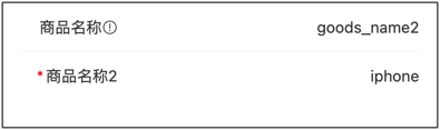
{
    type:"input",
    title:"商品名称",
    field:"goods_name",
    value:"iphone 7",
    props: {
        placeholder: '请输入商品名称',
        disabled: false,
    }
}
多行输入框
{
    type: 'field',
    title: '商品简介',
    field: 'goods_info',
    value: 'iphone info',
    props: {
        placeholder: '请输入商品简介',
        type: 'textarea',
        autosize: true,
    }
}
参考:Vant_Input (opens new window)
value :String
# Props
| 参数 | 说明 | 类型 | 默认值 |
|---|---|---|---|
| v-model | 当前输入的值 | number | string | - |
| label | 输入框左侧文本 | string | - |
| name | 名称,作为提交表单时的标识符 | string | - |
| id | 输入框 id,同时会设置 label 的 for 属性 | string | van-field-n-input |
| type | 输入框类型, 支持原生 input 标签的所有 type 属性 (opens new window),额外支持了 digit 类型 | FieldType | text |
| size | 大小,可选值为 large normal | string | - |
| maxlength | 输入的最大字符数 | number | string | - |
| placeholder | 输入框占位提示文字 | string | - |
| border | 是否显示内边框 | boolean | true |
| disabled | 是否禁用输入框 | boolean | false |
| readonly | 是否为只读状态,只读状态下无法输入内容 | boolean | false |
| colon | 是否在 label 后面添加冒号 | boolean | false |
| required | 是否显示表单必填星号 | boolean | 'auto' | null |
| center | 是否使内容垂直居中 | boolean | false |
| clearable | 是否启用清除图标,点击清除图标后会清空输入框 | boolean | false |
| clear-icon | 清除图标名称或图片链接,等同于 Icon 组件的 name 属性 (opens new window) | string | clear |
| clear-trigger | 显示清除图标的时机,always 表示输入框不为空时展示, focus 表示输入框聚焦且不为空时展示 | FieldClearTrigger | focus |
| clickable | 是否开启点击反馈 | boolean | false |
| is-link | 是否展示右侧箭头并开启点击反馈 | boolean | false |
| autofocus | 是否自动聚焦,iOS 系统不支持该属性 | boolean | false |
| show-word-limit | 是否显示字数统计,需要设置 maxlength 属性 | boolean | false |
| error | 是否将输入内容标红 | boolean | false |
| error-message | 底部错误提示文案,为空时不展示 | string | - |
| error-message-align | 错误提示文案对齐方式,可选值为 center right | FieldTextAlign | left |
| formatter | 输入内容格式化函数 | (val: string) => string | - |
| format-trigger | 格式化函数触发的时机,可选值为 onBlur | FieldFormatTrigger | onChange |
| arrow-direction | 箭头方向,可选值为 left up down | string | right |
| label-class | 左侧文本额外类名 | string | Array | object | - |
| label-width | 左侧文本宽度,默认单位为 px | number | string | 6.2em |
| label-align | 左侧文本对齐方式,可选值为 center right top | FieldTextAlign | left |
| input-align | 输入框对齐方式,可选值为 center right | FieldTextAlign | left |
| autosize | 是否自适应内容高度,只对 textarea 有效, 可传入对象,如 { maxHeight: 100, minHeight: 50 }, 单位为px | boolean | FieldAutosizeConfig | false |
| left-icon | 左侧图标名称或图片链接,等同于 Icon 组件的 name 属性 (opens new window) | string | - |
| right-icon | 右侧图标名称或图片链接,等同于 Icon 组件的 name 属性 (opens new window) | string | - |
| icon-prefix | 图标类名前缀,等同于 Icon 组件的 class-prefix 属性 (opens new window) | string | van-icon |
# Events
| 事件名 | 说明 | 回调参数 |
|---|---|---|
| focus | 输入框获得焦点时触发 | event: Event |
| blur | 输入框失去焦点时触发 | event: Event |
| clear | 点击清除按钮时触发 | event: MouseEvent |
| click | 点击组件时触发 | event: MouseEvent |
| clickInput | 点击输入区域时触发 | event: MouseEvent |
| clickLeftIcon | 点击左侧图标时触发 | event: MouseEvent |
| clickRightIcon | 点击右侧图标时触发 | event: MouseEvent |
| startValidate | 开始表单校验时触发 | - |
| endValidate | 结束表单校验时触发 | { status: string, message: string } |
← Hidden 隐藏字段 Radio 单选框 →