# Radio 单选框
# 规则
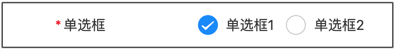
{
    type: 'radio',
    title: '单选框',
    field: 'radio',
    value: '1',
    props: {
        options: [
            {
                text: '单选框1',
                value: '1',
            },
            {
                text: '单选框2',
                value: '2',
            },
        ]
    }
}
参考:Vant_Radio (opens new window)
value :String | Number
# Options
| 字段名 | 说明 | 字段类型 | 是否必填 | 默认值 |
|---|---|---|---|---|
| value | 参数值 | String,Number | true | - |
| text | 字段别名 | String | true | - |
| disabled | 设置为禁用状态 | Boolean | false | false |
# Props
| 参数 | 说明 | 类型 | 默认值 |
|---|---|---|---|
| disabled | 是否禁用所有单选框 | boolean | false |
| direction | 排列方向,可选值为 horizontal | string | vertical |
| icon-size | 所有单选框的图标大小,默认单位为 px | number | string | 20px |
| checked-color | 所有单选框的选中状态颜色 | string | #1989fa |
| shape | 形状,可选值为 square dot | string | round |
# Events
| 事件名 | 说明 | 回调参数 |
|---|---|---|
| change | 当绑定值变化时触发的事件 | name: string |