

Stepper
Rule
Basic Example
js
const rule = {
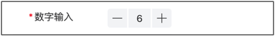
type: 'stepper',
title: 'Number Input',
field: 'stepper',
value: 6,
props: {
min: 5,
max: 10
}
}Props Configuration Examples
Set Value Range
js
const rule = {
    type: 'stepper',
    title: 'Purchase Quantity',
    field: 'quantity',
    value: 1,
    props: {
        min: 1,
        max: 100,
        step: 1,
    }
}
Decimal Precision
js
const rule = {
    type: 'stepper',
    title: 'Discount Rate',
    field: 'discount',
    value: 0.9,
    props: {
        min: 0,
        max: 1,
        step: 0.1,
        decimalLength: 1,
    }
}
Disable Input Box
js
const rule = {
    type: 'stepper',
    title: 'Quantity',
    field: 'quantity',
    value: 1,
    props: {
        disableInput: true,
        min: 1,
    }
}
Rounded Style
js
const rule = {
    type: 'stepper',
    title: 'Quantity',
    field: 'quantity',
    value: 1,
    props: {
        theme: 'round',
        min: 1,
    }
}
Events Examples
Handle Value Changes
js
const rule = {
    type: 'stepper',
    title: 'Purchase Quantity',
    field: 'quantity',
    value: 1,
    props: {
        min: 1,
        max: 100,
    },
    on: {
        change: (value, detail) => {
            console.log('Value changed:', value, detail);
        },
        plus: () => {
            console.log('Plus button clicked');
        },
        minus: () => {
            console.log('Minus button clicked');
        },
        overlimit: () => {
            console.log('Limit exceeded');
        },
    },
}
Calculate Total Price After Value Changes
js
const rule = [
    {
        type: 'stepper',
        title: 'Unit Price',
        field: 'price',
        value: 0,
        props: {
            min: 0,
            step: 0.01,
            decimalLength: 2,
        },
        inject: true,
        on: {
            change: ($inject, value) => {
                // Auto-calculate total price
                const quantity = $inject.api.getValue('quantity') || 1;
                const total = value * quantity;
                $inject.api.setValue('total', total.toFixed(2));
            },
        },
    },
    {
        type: 'stepper',
        title: 'Quantity',
        field: 'quantity',
        value: 1,
        props: {
            min: 1,
        },
        inject: true,
        on: {
            change: ($inject, value) => {
                // Calculate total price
                const price = $inject.api.getValue('price') || 0;
                const total = price * value;
                $inject.api.setValue('total', total.toFixed(2));
            },
        },
    },
    {
        type: 'stepper',
        title: 'Total Price',
        field: 'total',
        props: {
            disabled: true,
            decimalLength: 2,
        },
    },
]
Complete configuration items:Vant_Stepper
value :Number
Props
| Parameter | Description | Type | Default Value |
|---|---|---|---|
| min | Minimum value | number | string | 1 |
| max | Maximum value | number | string | - |
| auto-fixed | Whether to automatically correct values that exceed the limit range, set to false to prevent automatic correction | boolean | true |
| default-value | Initial value, takes effect when v-model is empty | number | string | 1 |
| step | Step size, value changed each time when clicked | number | string | 1 |
| name | Identifier, usually a unique string or number, can be obtained in the change event callback parameters | number | string | - |
| input-width | Input box width, default unit is px | number | string | 32px |
| button-size | Button size and input box height, default unit is px | number | string | 28px |
| decimal-length | Fixed number of decimal places to display | number | string | - |
| theme | Style theme, optional value is round | string | - |
| placeholder | Input box placeholder text | string | - |
| integer | Whether to only allow integer input | boolean | false |
| disabled | Whether to disable stepper | boolean | false |
| disable-plus | Whether to disable plus button | boolean | false |
| disable-minus | Whether to disable minus button | boolean | false |
| disable-input | Whether to disable input box | boolean | false |
| before-change | Callback function before input value changes, return false to prevent input, supports returning Promise | (value: number | string) => boolean | Promise<boolean> | false |
| show-plus | Whether to show plus button | boolean | true |
| show-minus | Whether to show minus button | boolean | true |
| show-input | Whether to show input box | boolean | true |
| long-press | Whether to enable long press gesture, enables long press on plus and minus buttons when enabled | boolean | true |
| allow-empty | Whether to allow empty input value, set to true to allow empty string | boolean | false |
Events
| Event Name | Description | Callback Parameters |
|---|---|---|
| change | Event triggered when bound value changes | value: string, detail: { name: string } |
| overlimit | Triggered when unavailable button is clicked | - |
| plus | Triggered when plus button is clicked | - |
| minus | Triggered when minus button is clicked | - |
| focus | Triggered when input box gains focus | event: Event |
| blur | Triggered when input box loses focus | event: Event |